Merging two WHO guideline platforms into a single site
WHO’s department for HIV, tuberculosis, hepatitis and sexually transmitted infections published its guidance across two separate platforms. They have been merged into one site, now live. Another designer wireframed it. I designed the interface.
Contents
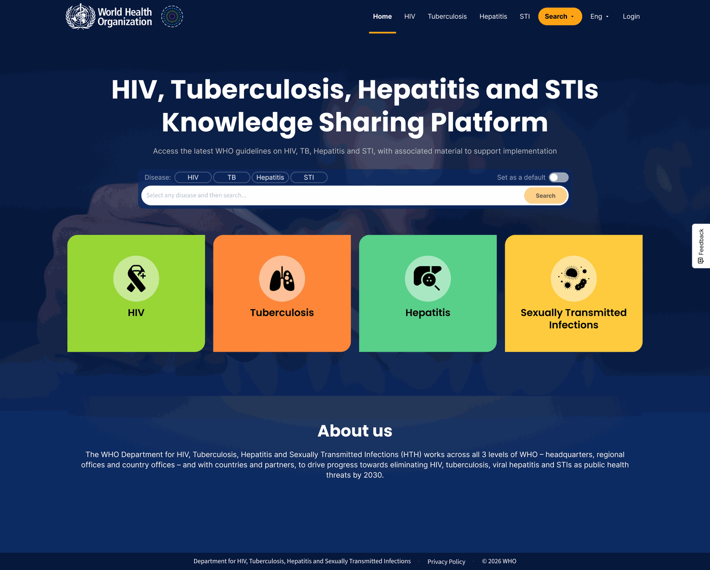
What the platform is
WHO’s Department for HIV, Tuberculosis, Hepatitis and Sexually Transmitted Infections publishes the guidance that health ministries and clinicians around the world work from. Until now that guidance lived in two places: a large tuberculosis platform, and a second one covering the other three diseases.
The two are being merged into one site. Same guidance, same audience, one address.
Nobody comes here to browse. Somebody arrives because they need the current recommendation on a specific thing, and they need to be certain it is the current one. That is the whole job of the site, and it is why the structure matters more than the surface.
Four areas that were never the same size
Merging two sites sounds like putting two things next to each other. It is not. It is deciding what the joined thing is, and every decision takes something away from somebody.
The hardest part here is that the four disease areas are wildly uneven. Tuberculosis has years of tooling behind it. The other three have guidelines, resources and training, and not much else.
| Area | What it brings to the merge | Shape |
|---|---|---|
| HIV | Guidelines, operational resources, training, research and innovation | 4 tabs · 3 categories |
| Hepatitis | Guidelines, operational resources, training, research and innovation | 4 tabs · 3 categories |
| Sexually transmitted infections | Guidelines, operational resources, training, research and innovation | 4 tabs · 3 categories |
| Tuberculosis | Guidelines, operational handbooks, training, research and innovation, a recommendation map, a drug dose finder, a screening tool, a downloadable app and an AI search assistant | 5 tabs · 6 categories · 3 tools |
On top of that, both platforms already had visitors with habits. People know where things live. A merge that moves everything is correct on paper and hostile in practice.
Nobody comes to a WHO guideline site to look around. They come to check one thing, and they need to know it is current.
What I did
Two designers. I did the interface — every screen, desktop and mobile. The wireframes came from the other designer.
The interface for the whole site, at desktop and at mobile. Every screen in the set.
The wireframes.
No research, and what I used instead
There was no research on this project, and I did not do any. No interviews, no testing, nobody from the department and nobody from the audience.
What I had was two things. A document setting out what the merged site had to contain, and the existing platforms themselves — which I went through in full, using them the way somebody looking for a guideline would, to find where they were awkward and where the design could be made more obvious.
That is not research. It is one designer’s reading of a site, and it carries one designer’s assumptions with it. But it is a great deal better than starting from the document alone, and most of what I changed came out of it.
That is a real limit and it is worth naming rather than dressing up. If I could have added one thing, it would have been watching a handful of people try to find a specific recommendation on the old sites — because the design rests on an assumption about how people arrive, and that assumption was never checked.
What the interface had to solve
The structure came to me as wireframes: four disease sections, a shared page underneath them, a filter rail, a search. What that leaves is the harder half of the problem — making four unequal areas look like one site, and making a page of clinical documents readable by someone who is in a hurry.
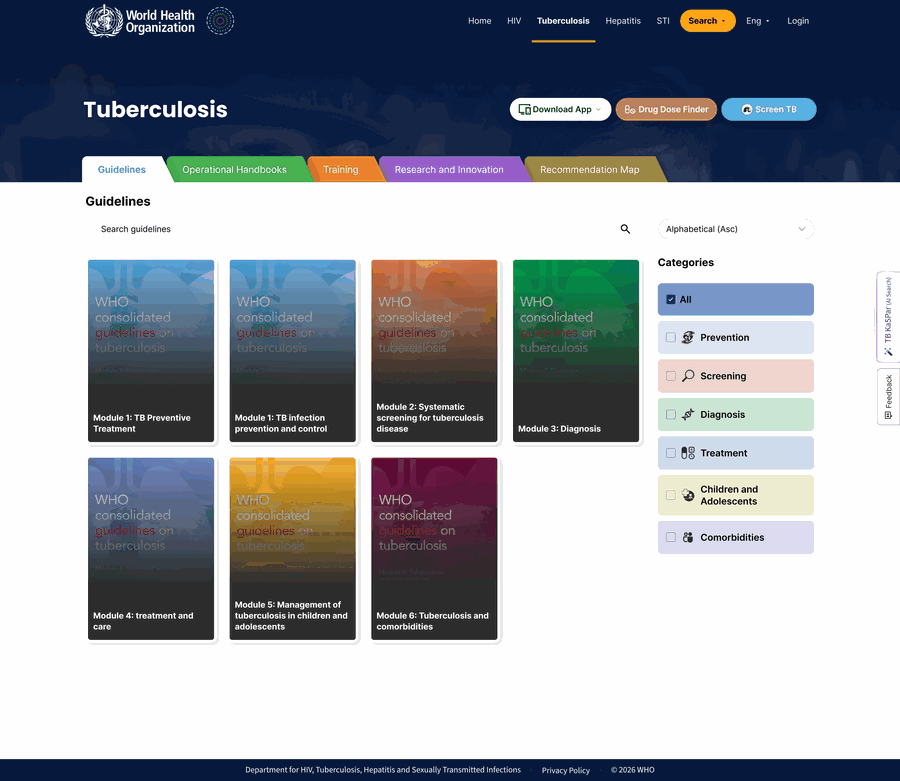
The tab row carries the difference, so the layout does not have to. Every disease area opens with the same coloured tabs in the same order. Tuberculosis simply has one more of them.
The alternative would have been to give tuberculosis a different page, which is what the two old platforms already did and what the merge existed to stop. Instead the extra content announces itself in the one place a person is already reading, and everything below it stays identical.
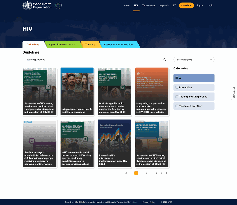
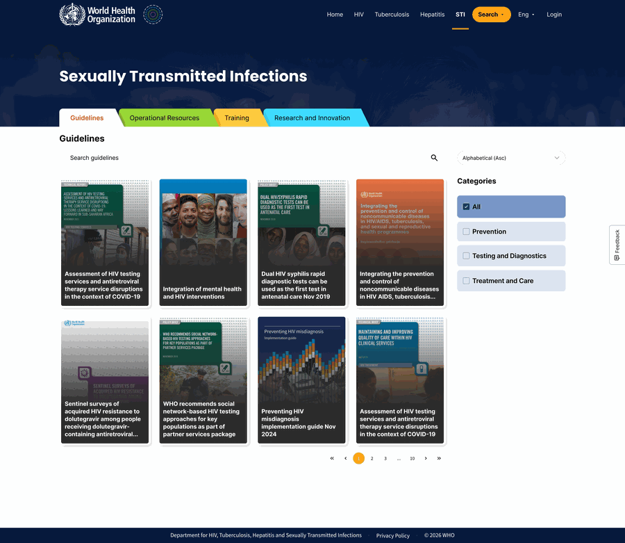
The cards had to survive artwork I did not control. Every guideline on this site has its own cover, and those covers are WHO’s: photographs, dense type, colours chosen years ago for print. A card that assumed a clean background would have failed on most of them.
So the title sits on a dark wash at the foot of the card, and the cover shows through above it. It is a plain solution and it is the reason a title is legible on a photograph of a crowd and on a pale technical cover without anyone checking each one.
Colour and icons only where they earn it. HIV, hepatitis and STIs filter by three categories, and three plain chips are enough — nobody needs help telling three things apart. Tuberculosis filters by six, so each one gets its own colour and its own icon.
The easy mistake would have been to colour all four alike for consistency. It would have looked tidier and helped nobody: four colours where three chips were already clear, and a decorative scheme where six genuinely need separating. The system is heavier in the one place that needs the weight.
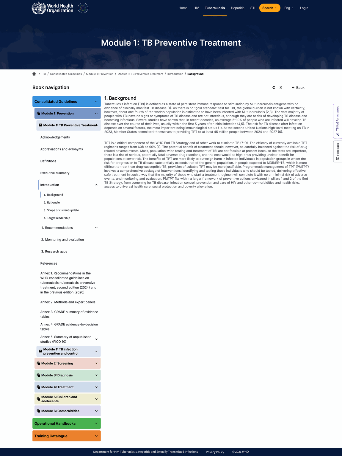
Those six colours then follow you into the document. The colour on a tuberculosis filter is the colour of that module inside the book navigation, four levels deeper. Prevention is blue at the top of the site and blue at the bottom of it.
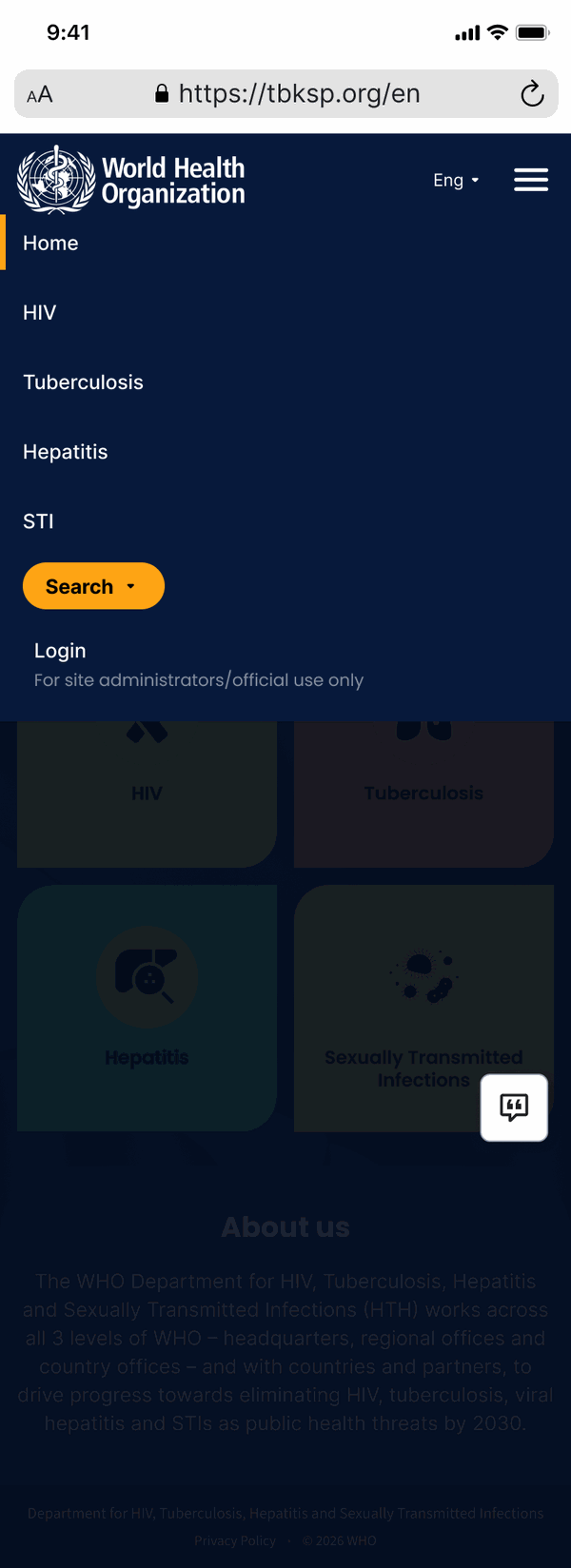
On a phone, everything stacks and nothing is dropped. The category chips become a row you push sideways rather than a rail down the side, the tools stay above the tabs, and the tab strip scrolls instead of wrapping — so the order you learned on desktop is the order you meet on a phone.
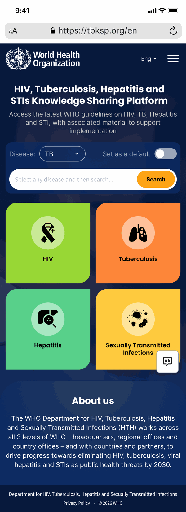
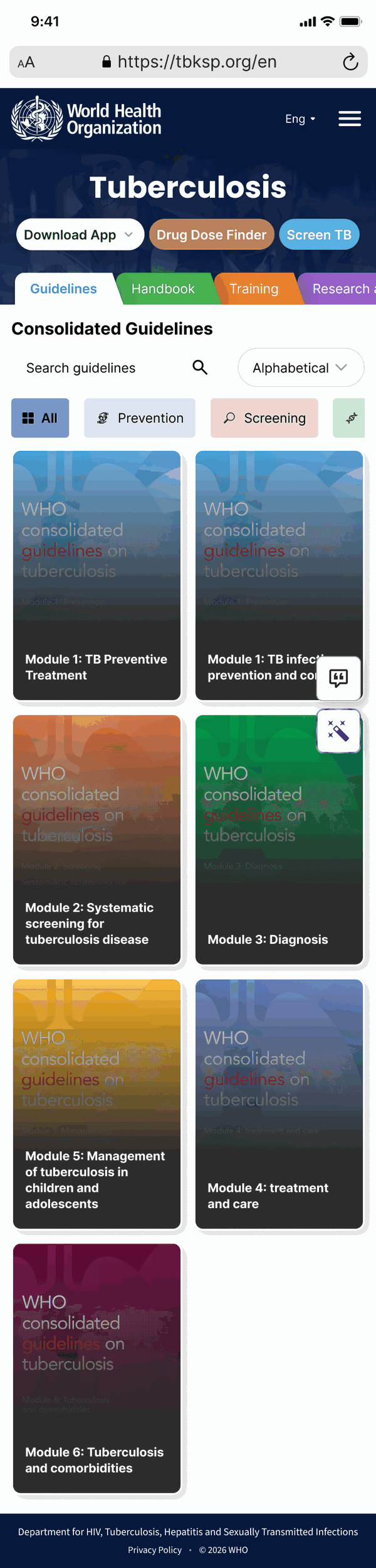
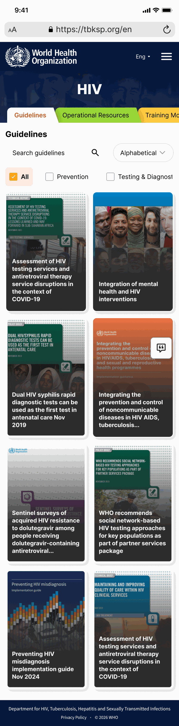
A card that assumed a clean background would have failed on most of them. WHO’s covers are photographs, and I did not get to choose them.
The part people actually came for
Everything above is about finding the right document. This is what happens once you have it, and it is where most guideline sites give up and hand you a PDF.
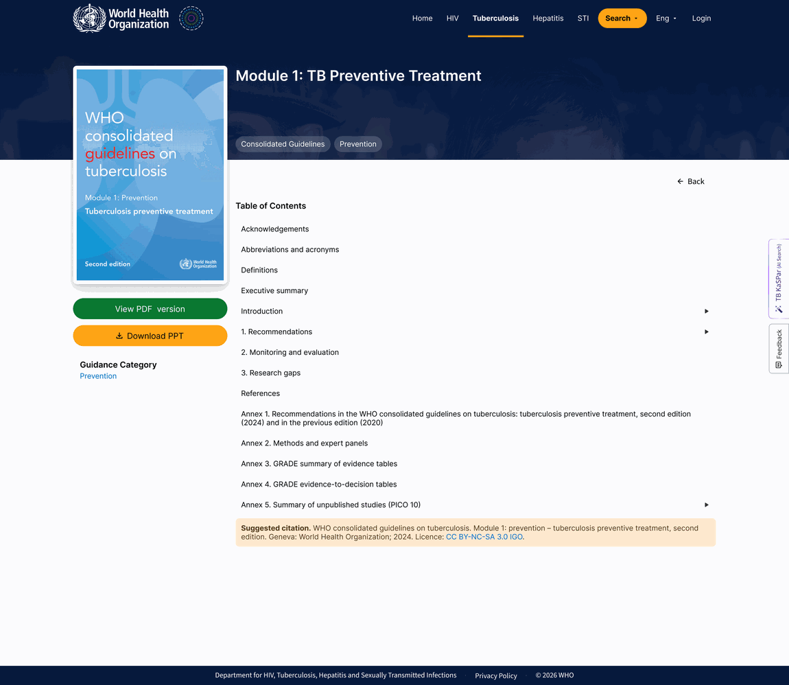
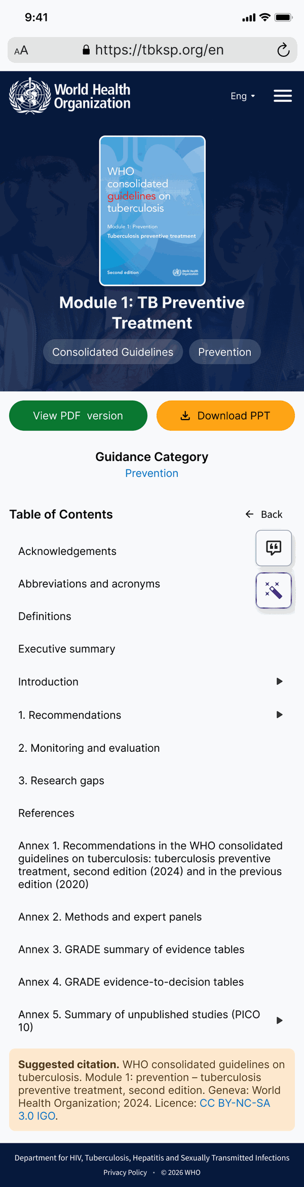
A guideline opens on a cover page: the document, its contents, and both ways out — the PDF for someone who wants the file, a slide deck for someone who has to present it. Open a section and the whole document becomes a navigable book, with every module and annex in a rail down the side and a trail across the top showing where you are.
The colour from the filter rail is still there, on the modules in the book navigation. Four levels deep, the category you started from is still visible.
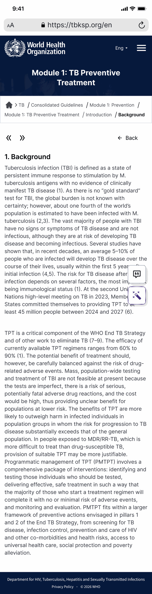
On a phone the rail cannot sit beside the text, so the book navigation collapses behind the menu — and the breadcrumb trail earns its place, because it becomes the only thing on screen telling you how deep you are.
The one place the merge did not finish
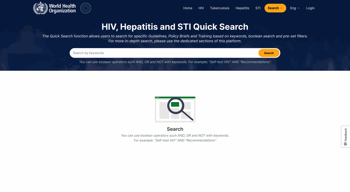
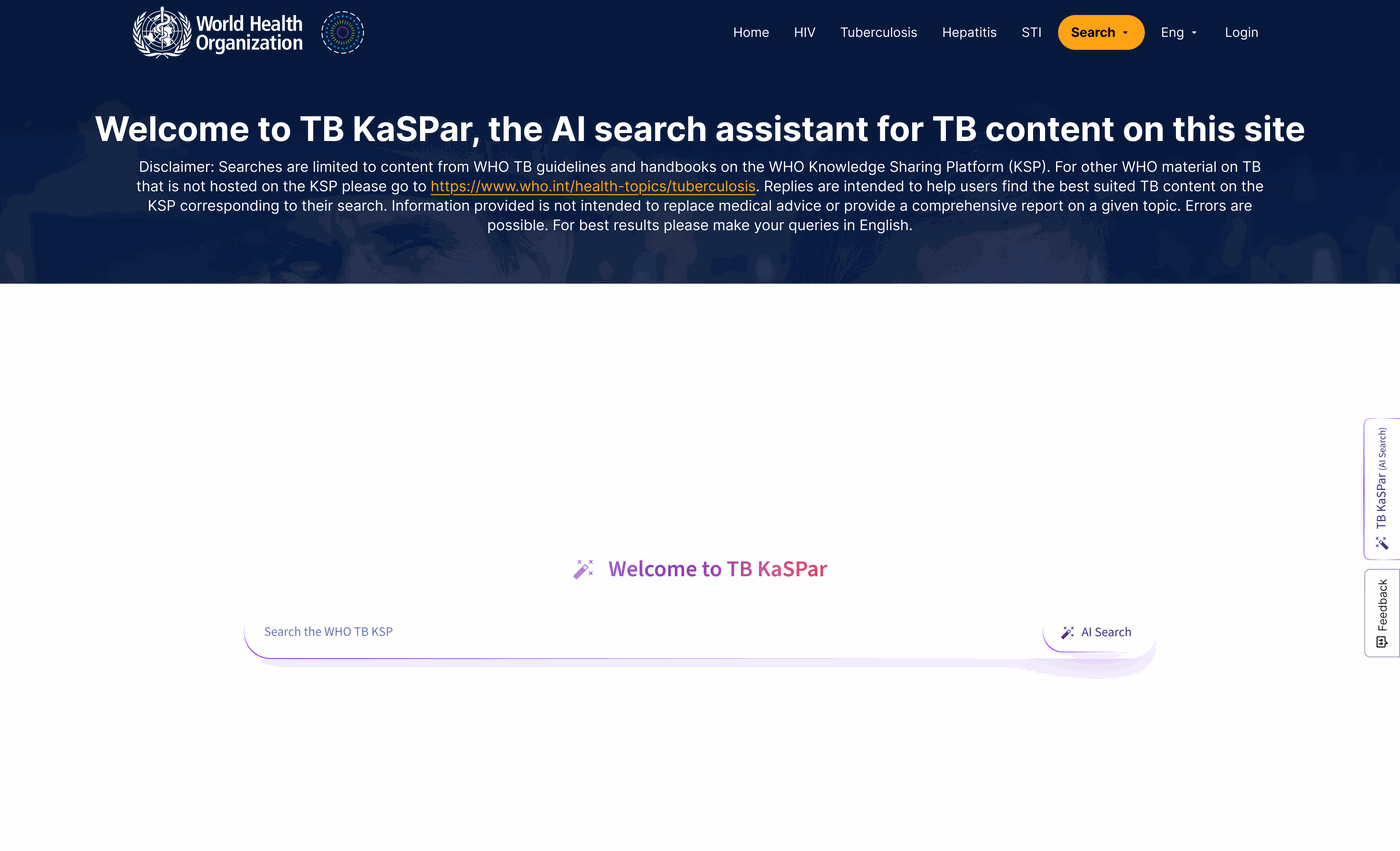
Search did not become one thing. There is a quick search for tuberculosis and a separate one for HIV, hepatitis and STIs, and they are not the same screen.
That is not an oversight, and it is worth being straight about. The tuberculosis index is far larger and differently shaped. Its search carries preset searches, direct links to dosage schedules and algorithms, category counts running into the hundreds, and an AI assistant scoped to tuberculosis content only. The other three get a keyword field and nothing else until they use it.
One merged search would have meant either burying the tuberculosis tooling, or showing three quarters of the audience a screen mostly full of things that do not apply to them.
What holds them together is the opening. Both start with the same header, the same title treatment, the same keyword field and the same line explaining that AND, OR and NOT will work — with an example. The lighter one then stops, and says in the empty space what it expects you to type. The heavier one keeps going. It reads as one site at two depths rather than two sites wearing the same coat.

Where this is now
It has been built and it is live.
The structure I was given rests on an assumption nobody tested: that people arrive knowing which disease they are looking for. Tuberculosis in people living with HIV is not a rare case, it is a whole category, and a person carrying that question has to pick one of four doors before the site will help them. The interface cannot fix that, and I would not claim it does.
What I would want to know about my own part is narrower and answerable: whether the six category colours actually get learned, or whether they read as decoration.An afternoon of watching people use it would settle it either way.